DAG rendering - take two
A few days ago I posted about some DAG rendering techniques we’re using in the new Plastic SCM release we’re working on.
Today I’d like to go through the alternative rendering techniques, the pros and cons of each of them, and then try to grab some feedback about which one is better.
Motivation
One of the main consequences of the DVCS age is the huge number of branches repositories have to deal with. Previously SVN, CVS, VSS and others (and I’d include P4 and now TFS in this pack) avoided branching as hell. But now everyone is embracing branching, so a good way to draw an item’s history and parallel evolution is required.
I’ll describe how Mercurial diagrams work (inTortoise Hg 2.0), then will do the same for Git using GitK and GitHub network graphs.
Two rendering styles
There are basically two alternatives right now for displaying version control graph diagrams:
- Vertical style: rendering nodes from top to bottom, top being the newest changes.
- Horizontal style: like the previous rotated 90 degrees clockwise.
Mercurial style
Mercurial (Hg) graph rendering uses the vertical style. The graph focuses on “commits” (or changesets/checkins, if you prefer) which are drawn top-down, starting with the more recent ones and going back in time as you scroll down.
The basic elements are displayed in the following picture:
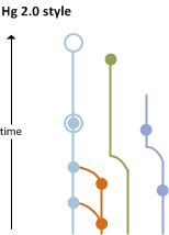
Commits are represented by circles, decorated differently depending on whether they’re simple, tagged, or loaded in the workspace. Each commit can have up to two parents. (In Hg every commit can only have one merge; multiple-merging is not supported.)
One interesting feature here is that branches are “bent” to reuse horizontal space when another branch ends. The graphic tries to be as narrow as possible, shrinking or growing horizontally depending on the number of parallel branches.
The next screenshot shows an actual image of a real repo, taken from the release notes of Tortoise Hg 2.0. I’ve highlighted a merge.
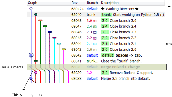
It is important to note that “merge links” are just lines between commits, with no special decoration. Of course, trained developers will immediately find them and recognize their meaning. “Branch terminators”, indicating that a Hg branch has been “closed”, appear as rectangles at the end of a branch.
Git(K) style
Let’s take a look at a GitK screenshot, maybe an overcomplicated one, extracted from http://blog.spearce.org/2007/07/difficult-gitk-graphs.html. Fortunately not all GitK graphcs are this hard to follow!
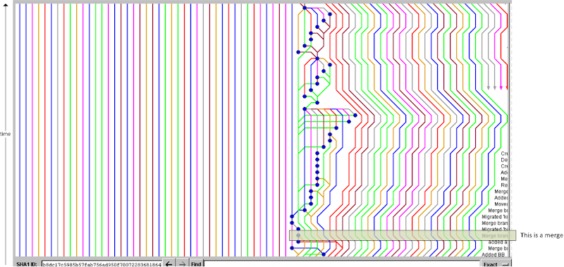
It’s clear that horizontal space can be wasted if there are too many active parallel development lines (branches) at a given point. I’ve marked a merge and, as with Hg, there are no special symbols to draw merges, just a line between two commits.
It is important to note that Git, unlike Mercurial, is able to handle multiple merges at the same time (a commit can have more than 2 parents).
GitK follows the same “vertical pattern” that Tortoise Hg uses. I find Hg rendering style more polished but I guess it is a matter of taste.
Rotate: enter the GitHub network graph
The GitHub “network graph” follows a more “traditional” rendering approach: branches extend from left to right instead of top to bottom.
It more closely resembles the kind of diagrams that most people draw on a blackboard when trying to explain how a project evolves.
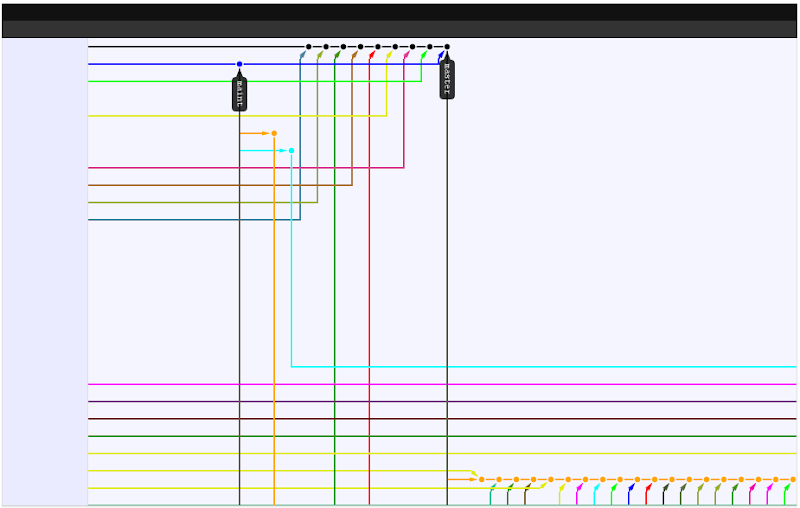
You have to click on the commits to see the related information. This differs from the vertical style, where the comment, committer and date always appear on the right.
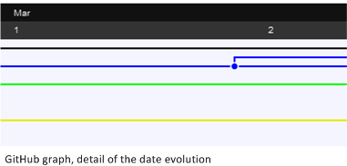
As time passes, the graph evolves to the right, with the dates represented like this:
Vertical style – pros & cons
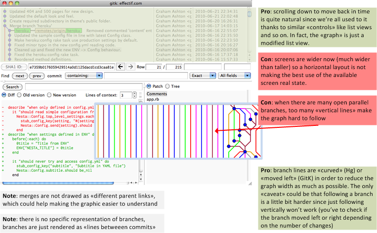
Using a GitK screenshot taken on a Mac OS X machine (see http://effectif.com/git/making-gitk-look-good-on-mac), I’ll summarize the pros & cons of the vertical style. BTW, feel free to send comments/suggestions.
Pros
- Scrolling down to move back in time is quite natural since we’re all used to it thanks to similar controls, such as list views. In fact, the entire graph is just a modified list view.
- Branch lines are bent (Hg) or moved left (GitK) in order to reduce the graph width as much as possible. Following a branch over time is a simple “vertical trip”; you have to check if the branch moved left or right depending on changes made on other branches.
Cons
- These days, most display screens are much wider than they are tall, so the vertical style does not make the best use of the available screen real estate.
- When there are many open parallel branches, too many vertical lines make the graph hard to follow.
- With GitK, the vertical space is even more constrained, since the graph usually occupies the top half of the overall window. (You can resize, but then you lose the bottom half of the window.)
- Colorblind people might easily get lost, depending on the colors (this also applies to the horizontal style).
And some notes:
- Merges are not drawn as different parent links, which could make the graph easier to understand. (We took care to do this in the Plastic SCM BranchExplorer.)
- There is no specific representation of branches; branches are just rendered as lines between commits. (This is probably a controversial point for DVCS purists, since branches in Git and Hg, while extremely useful, are not as “strong” as they are in other SCM systems. (That is, the important concept is the “commit”, and the branch tends to be secondary. In fact, Hg is able to do “anonymous” branching.)
Horizontal style - pros & cons
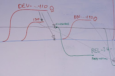
The horizontal style is the one I’m more used to, because it’s the one we use (so far) in the Plastic SCM BranchExplorer. It also resembles quite naturally what we normally draw on a blackboard to depict releases, branching patterns on a project, and so on. The following picture shows a hand-made branching (or release) diagram. It seems more natural to draw it this way, because people are more used to graphs in which time is on the horizontal axis than on the vertical axis...
Pros
- Better use of modern ”landscape”-style display screens.
- More natural, since the graph better resembles blackboard diagrams of branching structures.
Cons
- When there are tons of parallel lines (lots of open branches). you might have to scroll down to find your branch.
Conclusion, questions and thoughts
First some questions and thoughts:
- None of the Git or Hg tools display “merge links” as such. Do you miss this information? (I ask this because I always draw it manually on the blackboard and we implemented it this way in our BranchExplorer).
- I’m not aware of zooming capabilities on GitK or Tortoise Hg to deal with the branching diagram. Do you think it is useful?
- Finding the perfect rendering technique seems to be difficult. For instance when repositories are big enough there will always be a ton of branches and commits (changesets), so rendering all of them can make the graphic confusing. One of the things we’re working on is having an option to render “relevant commits only” (only changesets that are involved in a merge or are at the beginning or end of a branch ):

- Neither Hg nor Git displays “branches” as such, as elements. What do you think about it? I’m totally biased here towards what we do with the BranchExplorer but I’m more used to the following where branches are depicted as “first class citizens”:

Conclusion
Drawing branch diagrams (or release diagrams, if you prefer) is not an easy task, because everything looks great when there are only a few branches and changesets involved, but easily becomes hell with real projects with tons of branching and merging.
Filtering – the ability to temporarily suppress the display of branches you’re not currently interested in – might be the best option to keep things under control.


Another tool that gets this more right in my opinion is qbzr (the default gui for bazaar). It's much more appealing to look at than either hg or git's log.
ReplyDelete[Sorry for answering in spanish, but I don't have the time right now to think in English]
ReplyDeleteEn mi opinión, la representación vertical es una herencia de los desarrollos centralizados donde todos los "commits" pasaban por un único servidor (y además no se promocionaba el "branching" para desarrollos temporales paralelos), de tal manera que todos los commits eran posteriores cada uno al previo.
Sin embargo, esa característica desaparece con los sistemas de desarrollo distribuidos donde los repositorios se van actualizando cuando conviene; y además cada desarrollador puede tener una "visión parcial" de un repositorio. Es por ello que creo que, en los sistemas de desarrollo distribuidos, la representación horizontal debería ser "obligatoria".
Tenemos que tener en cuenta que para la trazabilidad del proyecto lo importante son los contenidos del mismo (o dicho de otra forma, los commits que nos han llevado a una determinada versión); sin embargo, a la hora de analizar la evolución de un proyecto, el parámetro fundamental es su evolución en el tiempo.
Es por ello que echo de menos que herramientas como mercurial me permitan, no sólo la representación vertical de los commits, sino también la opción de poder ordenar los commits por la fecha y hora en la que se produjeron (originalmente, no cuando se importaron al repositorio actual). A partir de ahí, sería maravilloso poder hacer zoom-in, zoom-out en la línea temporal y poder ir viendo de diferentes formas tanto los branches, como los commits, tags, etc...
Evidentemente es mi opinión, pero es una de las pocas carencias que puedo observar actualmente en una herramienta como Mercurial (TortoiseHg).
@The Sharp Penguin: según lo que comentas el branch explorer de Plastic encaja en lo que estás buscando, no?? Por el tema de zooms, ordenación, etc, etc.
ReplyDeleteHas visto las previews de 4.0??